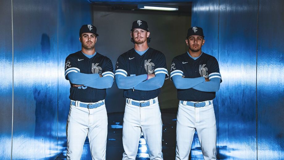
The Kansas City Royals have unveiled their City Connect uniforms, a tribute to the city’s iconic fountains and art deco architecture.
“They’ve been a huge part of Kansas City beautifying the streets,” Royals senior vice president Sarah Tourville said. “There was a fine line between making sure it was complementary to their entire uniform portfolio, not offending the baseball purist, but also being bold enough to do what it was intended to do, which is appeal to a younger fan and diverse”.
The logo on the sleeve is an homage to the team’s original franchise logo from 1969. The triple braid on the sleeves is reminiscent of the team’s uniform from the 1980s, while the style of the new number is a reference to art architecture. decoration of the city On the inside of the collar is stitched “HEY HEY HEY HEY”, a nod to Paul McCartney’s Royals victory song.
While the Royals are traditionally associated with light blue, the decision to go navy is a reference to the city’s baseball history with the Athletics, Monarchs, Blues, Blue Sox and Packers all wearing the uniform in a moment or another.
“The only thing we didn’t do was barbecue,” Tourville said. “It was so obvious and we wanted something that felt more fresh and advanced.”
The Royals also chose from designs that referenced the city’s relationship with barbecue and jazz.
“This design is one that fans of any age can really appreciate,” said Royals CEO John Sherman. “From the fonts that are part of Kansas City’s heritage, to the jersey colors that represent the rich history of baseball and the Kansas City Royals. The uniform showcases the many elements of our community.”
The Royals will debut their City Connect uniforms on April 30 against the New York Yankees .

